![]()
2.2 Correlation#
Correlation quantifies the strength and direction of the linear relationship between two variables. It’s one of the most important tools for understanding how variables are related.
Why Correlation Matters#
Scatter plots show us visual patterns. Correlation gives us numbers to:
Quantify relationship strength
Compare different relationships objectively
Make predictions
Test hypotheses statistically
2.2.1 The Correlation Coefficient#
Definition: For normalized data {(x̂ᵢ, ŷᵢ)}, the correlation is:
Interpretation#
Range: \(-1 \leq r \leq 1\)
+1: Perfect positive correlation (x̂ = ŷ)
-1: Perfect negative correlation (x̂ = -ŷ)
0: No linear relationship
Symmetric: corr(x,y) = corr(y,x)
Unaffected by translation or positive scaling
Sign tells direction:
\(r > 0\): Positive correlation ↗ (as x increases, y tends to increase)
\(r < 0\): Negative correlation ↘ (as x increases, y tends to decrease)
\(r = 0\): No linear correlation ●
Magnitude tells strength:
\(|r| = 1\): Perfect linear relationship
\(|r| ≥ 0.7\): Strong correlation
\(0.3 ≤ |r| < 0.7\): Moderate correlation
\(|r| < 0.3\): Weak correlation
Note: These are guidelines - interpretation depends on context!
import numpy as np
import pandas as pd
from scipy import stats
import matplotlib.pyplot as plt
import seaborn as sns

# Set style
plt.style.use('seaborn-v0_8-darkgrid')
sns.set_palette("husl")
np.random.seed(42)
Computing Correlation: Three Methods#
Worked Example: Height and Weight#
Consider a dataset of 6 people with heights (cm) and weights (kg):
# Data
heights = np.array([160, 165, 170, 175, 180, 185])
weights = np.array([55, 62, 68, 75, 81, 88])

# Display as table
df_hw = pd.DataFrame({'Height (cm)': heights, 'Weight (kg)': weights})
df_hw.index.name = 'Person'
df_hw.index += 1
print(df_hw)
print(f"\nMean height: {np.mean(heights):.1f} cm")
print(f"Mean weight: {np.mean(weights):.1f} kg")
print(f"Std height: {np.std(heights):.2f} cm")
print(f"Std weight: {np.std(weights):.2f} kg")
        Height (cm)  Weight (kg)
Person
1               160           55
2               165           62
3               170           68
4               175           75
5               180           81
6               185           88

Mean height: 172.5 cm
Mean weight: 71.5 kg
Std height: 8.54 cm
Std weight: 11.18 kg
# METHOD 1: Using NumPy
r_numpy = np.corrcoef(heights, weights)[0, 1]

# METHOD 2: Using SciPy (also gives p-value)
r_scipy, p_value = stats.pearsonr(heights, weights)

# METHOD 3: Manual calculation (educational!)
mean_x = np.mean(heights)
mean_y = np.mean(weights)
std_x = np.std(heights)
std_y = np.std(weights)

# Step 1: Standardize
z_x = (heights - mean_x) / std_x
z_y = (weights - mean_y) / std_y

# Step 2: Multiply and average
r_manual = np.mean(z_x * z_y)

# Display results
print(f"Method 1 (NumPy):   r = {r_numpy:.4f}")
print(f"Method 2 (SciPy):   r = {r_scipy:.4f}")
print(f"Method 3 (Manual):  r = {r_manual:.4f}")
print(f"P-value: {p_value:.6f}")
Method 1 (NumPy):   r = 0.9998
Method 2 (SciPy):   r = 0.9998
Method 3 (Manual):  r = 0.9998
P-value: 0.000000
Interpretation of Results#
With \(r \approx 1\), we have a very strong positive correlation:
r ≈ 1 indicates a nearly perfect linear relationship
Taller people almost always weigh more in this dataset
We can make accurate predictions using this relationship
The p-value tells us whether the correlation is statistically significant. A very small p-value (< 0.05) means we can reject the null hypothesis that there’s no correlation.
Manual Calculation Breakdown#
Let’s see the step-by-step standardization process:
# Display standardized values
calc_df = pd.DataFrame({
    'x': heights,
    'y': weights,
    'z_x': z_x,
    'z_y': z_y,
    'z_x × z_y': z_x * z_y
})
print(calc_df.round(3))
print(f"\nSum of (z_x × z_y): {np.sum(z_x * z_y):.4f}")
print(f"Divide by N = {len(heights)}: r = {np.sum(z_x * z_y) / len(heights):.4f}")
     x   y    z_x    z_y  z_x × z_y
0  160  55 -1.464 -1.476      2.161
1  165  62 -0.878 -0.850      0.747
2  170  68 -0.293 -0.313      0.092
3  175  75  0.293  0.313      0.092
4  180  81  0.878  0.850      0.747
5  185  88  1.464  1.476      2.161

Sum of (z_x × z_y): 5.9986
Divide by N = 6: r = 0.9998
Properties of Correlation#
Understanding these properties is crucial for working with correlation correctly!
Property |
Description |
Implication |
|---|---|---|
Symmetry |
\(\text{corr}(x,y) = \text{corr}(y,x)\) |
Order doesn’t matter |
Translation Invariance |
Adding constants doesn’t change \(r\) |
Only relative positions matter |
Scale Invariance |
Multiplying by positive constants preserves \(r\) |
Units don’t affect correlation |
Sign Flip |
Multiplying by negative reverses sign |
Direction changes, magnitude preserved |
Bounded |
\(-1 \leq r \leq 1\) always |
Mathematical guarantee |
# Demonstrate correlation properties
x_orig = np.array([1, 2, 3, 4, 5])
y_orig = np.array([2, 4, 5, 7, 9])
r_orig = np.corrcoef(x_orig, y_orig)[0, 1]

print(f"Original data correlation: r = {r_orig:.4f}\n")

# Property 1: Symmetry
r_xy = np.corrcoef(x_orig, y_orig)[0, 1]
r_yx = np.corrcoef(y_orig, x_orig)[0, 1]
print(f"1. SYMMETRY: corr(x,y) = {r_xy:.4f}, corr(y,x) = {r_yx:.4f} ✓")

# Property 2: Translation invariance
x_translated = x_orig + 100
y_translated = y_orig + 50
r_translated = np.corrcoef(x_translated, y_translated)[0, 1]
print(f"2. TRANSLATION: After adding (100, 50): r = {r_translated:.4f} ✓")

# Property 3: Scale invariance (magnitude)
x_scaled = x_orig * 10
y_scaled = y_orig * 5
r_scaled = np.corrcoef(x_scaled, y_scaled)[0, 1]
print(f"3. SCALING: After scaling (10×, 5×): r = {r_scaled:.4f} ✓")

# Property 4: Negative scaling reverses sign
x_neg = x_orig * (-1)
r_neg = np.corrcoef(x_neg, y_orig)[0, 1]
print(f"4. SIGN FLIP: After x → -x: r = {r_neg:.4f} ✓")
Original data correlation: r = 0.9948

1. SYMMETRY: corr(x,y) = 0.9948, corr(y,x) = 0.9948 ✓
2. TRANSLATION: After adding (100, 50): r = 0.9948 ✓
3. SCALING: After scaling (10×, 5×): r = 0.9948 ✓
4. SIGN FLIP: After x → -x: r = -0.9948 ✓
2.2.2 Using Correlation to Predict#
Assume we have \(N\) pairs of data points \((x_i, y_i)\) with correlation \(r\).
Assume we have a new value \((x_0,?)\) and want to predict the corresponding \(y_0\) value. We can use the correlation coefficient to make this prediction!
Standardize \(x_0\) to get \(\hat{x}_0\) and then predict the value of \(\hat{y}^p_0\):
We want to construct a prediction function which gives a prediction for any value of \(\hat{x}\). For each of the \((x_i,y_i)\) pairs in our data set, the predictor should take \(x_i\) and produce a result as close to \(y_i\) as possible.
If we predict using a linear function, then we have, for some unknown a, b, that \(\hat{y}^p_i = a \cdot \hat{x}_i + b\).
let \(u_i = \hat{y}_i - \hat{y}^p_i\) be the error of our prediction for the \(i\)th data point. We would like to have \(mean(u_i) = 0\).
Since we want \(mean(u) = 0\), we must have \(b = 0\).
Now we have \(\hat{y}^p_i = a \cdot \hat{x}_i\). We want to find the value of \(a\) that minimizes the variance of the error \(u_i\):
To minimize this, we take the derivative with respect to \(a\) and set it to zero:
Hence, the best linear predictor is \(\hat{y}^p = r \cdot \hat{x}\).
In standard coordinates, the prediction is:#
In original coordinates, the prediction is:#
Root Mean Squared Error (RMSE) of the Prediction#
Rule of Thumb 💡#
If x is k standard deviations from its mean, then y is predicted to be r•k standard deviations from its mean.
Or even simpler:
When x goes up by 1 standard deviation, y goes up by r standard deviations.
Worked Example: Predicting Weight from Height#
# Using the height-weight data
heights = np.array([160, 165, 170, 175, 180, 185])
weights = np.array([55, 62, 68, 75, 81, 88])

# Statistics
h_mean = np.mean(heights)
h_std = np.std(heights)
w_mean = np.mean(weights)
w_std = np.std(weights)
r = np.corrcoef(heights, weights)[0, 1]

print("Dataset Statistics:")
print(f"  Height: μ = {h_mean:.1f} cm, σ = {h_std:.2f} cm")
print(f"  Weight: μ = {w_mean:.1f} kg, σ = {w_std:.2f} kg")
print(f"  Correlation: r = {r:.4f}")

# Predict weight for height = 172 cm
h_new = 172
w_pred = w_mean + r * (w_std / h_std) * (h_new - h_mean)

# Using rule of thumb
h_std_dev = (h_new - h_mean) / h_std
w_std_dev = r * h_std_dev
w_pred2 = w_mean + w_std_dev * w_std

print(f"\nPrediction for height = {h_new} cm:")
print(f"  Height is {h_std_dev:.3f} std devs from mean")
print(f"  Weight predicted: {w_std_dev:.3f} std devs from mean")
print(f"  Predicted weight: {w_pred:.2f} kg")
Dataset Statistics:
  Height: μ = 172.5 cm, σ = 8.54 cm
  Weight: μ = 71.5 kg, σ = 11.18 kg
  Correlation: r = 0.9998

Prediction for height = 172 cm:
  Height is -0.059 std devs from mean
  Weight predicted: -0.059 std devs from mean
  Predicted weight: 70.85 kg
Creating a Prediction Function#
We can encapsulate the prediction logic into a reusable function:
def predict_from_correlation(x_new, x_data, y_data):
    """
    Predict y from x using correlation.

    Parameters:
    -----------
    x_new : float or array - New x value(s) to predict y for
    x_data : array - Historical x data
    y_data : array - Historical y data

    Returns:
    --------
    y_pred : float or array - Predicted y value(s)
    """
    r = np.corrcoef(x_data, y_data)[0, 1]
    x_mean, y_mean = np.mean(x_data), np.mean(y_data)
    x_std, y_std = np.std(x_data), np.std(y_data)

    return y_mean + r * (y_std / x_std) * (x_new - x_mean)

# Test with multiple heights
test_heights = [160, 170, 180, 190, 200]

print("Height (cm) → Predicted Weight (kg)")
print("-" * 35)
for h in test_heights:
    w = predict_from_correlation(h, heights, weights)
    print(f"   {h:3d} cm    →    {w:5.1f} kg")
Height (cm) → Predicted Weight (kg)
-----------------------------------
   160 cm    →     55.1 kg
   170 cm    →     68.2 kg
   180 cm    →     81.3 kg
   190 cm    →     94.4 kg
   200 cm    →    107.5 kg
Notice the linear pattern in predictions! Each 10 cm increase in height predicts the same weight increase. This is a fundamental property of correlation-based prediction.
Key insights:
If \(|r| = 1\) (perfect correlation), RMSE = 0 (perfect predictions)
If \(|r| = 0\) (no correlation), RMSE = \(\sigma_y\) (predictions no better than guessing the mean)
Higher \(|r|\) → lower RMSE → better predictions!
# Calculate prediction error
rmse = w_std * np.sqrt(1 - r**2)

print("Prediction Accuracy Metrics:")
print(f"  Correlation: r = {r:.4f}")
print(f"  R-squared: r² = {r**2:.4f} ({r**2*100:.1f}% variance explained)")
print(f"  RMSE = σ_y × √(1 - r²) = {w_std:.2f} × √(1 - {r**2:.4f}) = {rmse:.2f} kg")
Prediction Accuracy Metrics:
  Correlation: r = 0.9998
  R-squared: r² = 0.9995 (100.0% variance explained)
  RMSE = σ_y × √(1 - r²) = 11.18 × √(1 - 0.9995) = 0.24 kg
Interpretation:
Typical prediction error is approximately ±RMSE
High correlation (\(r \approx 1\)) means very accurate predictions
The \(r^2\) value tells us what proportion of variance in \(y\) is explained by \(x\)
Visualizing Different Correlation Values#
Let’s see what different correlation values look like:
# Generate data with different correlations
def generate_correlated_data(r_target, n=100):
    """Generate data with specified correlation."""
    x = np.random.randn(n)
    y = r_target * x + np.sqrt(1 - r_target**2) * np.random.randn(n)
    return x, y

# Create grid of plots
fig, axes = plt.subplots(2, 3, figsize=(15, 10))
correlations = [1.0, 0.8, 0.5, 0.0, -0.5, -0.8]

for idx, r_val in enumerate(correlations):
    row, col = idx // 3, idx % 3
    ax = axes[row, col]

    x, y = generate_correlated_data(r_val)
    r_actual = np.corrcoef(x, y)[0, 1]

    color = 'darkgreen' if r_actual > 0 else ('darkred' if r_actual < 0 else 'gray')

    ax.scatter(x, y, alpha=0.6, s=30, color=color)
    ax.set_title(f'r = {r_actual:.2f}', fontsize=13, fontweight='bold')
    ax.set_xlabel('X (standardized)')
    ax.set_ylabel('Y (standardized)')
    ax.grid(True, alpha=0.3)
    ax.axhline(y=0, color='black', linewidth=0.5, alpha=0.3)
    ax.axvline(x=0, color='black', linewidth=0.5, alpha=0.3)

    # Add best-fit line
    x_line = np.array([ax.get_xlim()[0], ax.get_xlim()[1]])
    ax.plot(x_line, r_actual * x_line, 'r--', linewidth=2, alpha=0.5)

plt.suptitle('Different Correlation Values', fontsize=16, fontweight='bold', y=1.00)
plt.tight_layout()
plt.show()
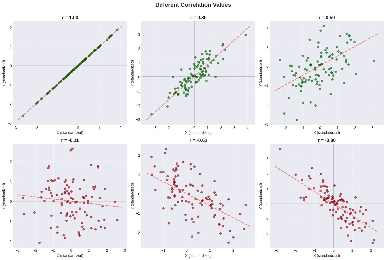
Pattern Guide#
Correlation |
Visual Pattern |
Description |
|---|---|---|
\(r = +1.0\) |
Perfect upward line |
All points on the line |
\(r = +0.8\) |
Tight upward cloud |
Strong positive trend |
\(r = +0.5\) |
Loose upward cloud |
Moderate positive trend |
\(r = 0.0\) |
Circular cloud |
No linear relationship |
\(r = -0.5\) |
Loose downward cloud |
Moderate negative trend |
\(r = -0.8\) |
Tight downward cloud |
Strong negative trend |
2.2.3 Confusion Caused by Correlation#
⚠️ Critical Warning: Correlation ≠ Causation!#
Just because two variables are correlated does NOT mean one causes the other!
Three possible explanations for correlation:
X causes Y: Pressing accelerator → car speeds up
Y causes X: (Sometimes) Happiness → success
Hidden variable Z causes both: Temperature → ice cream sales AND drownings
Example 1: Spurious Correlation - Ice Cream and Drowning#
# Famous spurious correlation example
months = np.arange(1, 13)
summer_effect = np.sin((months - 3) * np.pi / 6)

ice_cream = 100 + 80 * summer_effect + np.random.normal(0, 5, 12)
drownings = 20 + 30 * summer_effect + np.random.normal(0, 2, 12)

r_spurious = np.corrcoef(ice_cream, drownings)[0, 1]

# Plot
fig, (ax1, ax2) = plt.subplots(1, 2, figsize=(14, 5))

month_names = ['Jan','Feb','Mar','Apr','May','Jun','Jul','Aug','Sep','Oct','Nov','Dec']
ax1.plot(months, ice_cream, 'o-', linewidth=2, label='Ice Cream Sales', color='coral')
ax1.plot(months, drownings, 's-', linewidth=2, label='Drownings', color='steelblue')
ax1.set_xlabel('Month', fontsize=12)
ax1.set_ylabel('Count', fontsize=12)
ax1.set_title('Ice Cream Sales vs Drownings Over Time', fontsize=13, fontweight='bold')
ax1.set_xticks(months[::2])
ax1.set_xticklabels([month_names[i-1] for i in months[::2]])
ax1.legend()
ax1.grid(True, alpha=0.3)

ax2.scatter(ice_cream, drownings, s=100, alpha=0.6, color='orange', edgecolors='black')
ax2.set_xlabel('Ice Cream Sales', fontsize=12)
ax2.set_ylabel('Drownings', fontsize=12)
ax2.set_title(f'Scatter Plot (r = {r_spurious:.3f})', fontsize=13, fontweight='bold')
ax2.grid(True, alpha=0.3)

plt.tight_layout()
plt.show()

print(f"Correlation: r = {r_spurious:.3f}")
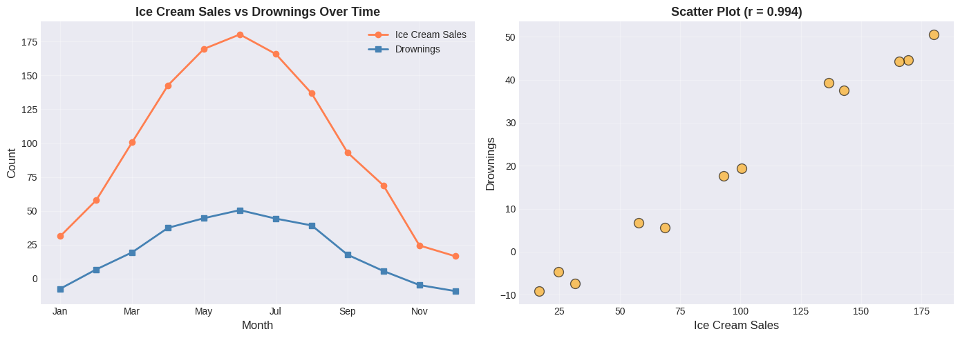
Correlation: r = 0.994
⚠️ Spurious Correlation Alert!#
Does ice cream cause drowning? Of course not!
The real explanation involves a hidden variable:
SUMMER (warm weather)
├── → More ice cream sales
└── → More swimming → More drownings
Lesson: Always think critically about WHY variables correlate!
Questions to ask:
Could X directly cause Y?
Could Y directly cause X?
Could a third variable cause BOTH?
Is this just coincidence?
Example 2: Confounding Variable - Shoe Size and Reading Ability#
# Simulate children's data
n_children = 50
ages = np.random.uniform(5, 15, n_children)

# Both increase with age!
shoe_sizes = 10 + 1.5 * ages + np.random.normal(0, 1, n_children)
reading_scores = 20 + 5 * ages + np.random.normal(0, 5, n_children)

r_shoes_reading = np.corrcoef(shoe_sizes, reading_scores)[0, 1]

# Plot
plt.figure(figsize=(10, 6))
scatter = plt.scatter(shoe_sizes, reading_scores, c=ages, cmap='viridis',
                     s=100, alpha=0.6, edgecolors='black')
plt.colorbar(scatter, label='Age (years)')
plt.xlabel('Shoe Size', fontsize=12)
plt.ylabel('Reading Score', fontsize=12)
plt.title(f'Shoe Size vs Reading Ability (r = {r_shoes_reading:.3f})',
          fontsize=14, fontweight='bold')
plt.grid(True, alpha=0.3)
plt.tight_layout()
plt.show()

print(f"Correlation: r = {r_shoes_reading:.3f}")
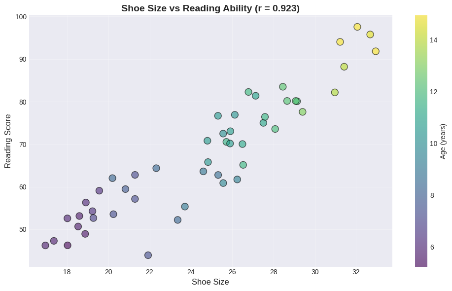
Correlation: r = 0.923
The Confounding Variable: AGE#
Does having bigger feet make you read better? Obviously not!
The hidden variable is age:
Age → Bigger feet (physical growth)
Age → Better reading (more practice)
Notice in the plot:
Purple points (younger children) cluster in the bottom-left
Yellow points (older children) cluster in the top-right
Key insight: If we control for age, the correlation between shoe size and reading ability disappears!
2.3 Real-World Case Study: Sterile Males in Wild Horse Herds#
Let’s apply everything we’ve learned to a real conservation problem!
The Problem#
Question: Do sterilized males reduce foal births in wild horse herds?
Hypothesis: More sterile males → fewer foals
Data: Observations over 3 years of:
Number of adults
Number of sterile males
Number of foals
Let’s see what the data shows!
# Wild horse herd data
days = np.array([0, 6, 39, 40, 66, 67, 335, 336, 360, 361, 374, 375, 404, 696, 700, 710, 738, 742, 772])
adults = np.array([62, 60, 58, 59, 56, 58, 47, 46, 44, 45, 42, 43, 40, 35, 34, 33, 32, 31, 30])
sterile = np.array([5, 5, 7, 7, 8, 8, 9, 9, 9, 9, 8, 9, 8, 7, 7, 6, 5, 5, 4])
foals = np.array([12, 11, 14, 13, 15, 14, 6, 6, 7, 6, 4, 3, 2, 3, 1, 2, 1, 1, 0])

# Create DataFrame
horse_data = pd.DataFrame({
    'Day': days, 'Adults': adults, 'Sterile_Males': sterile, 'Foals': foals
})

print("Wild Horse Herd Data:")
print(horse_data.head(10))
print(f"\nDataset: {len(days)} observations over {days[-1]} days (~2 years)")
Wild Horse Herd Data:
   Day  Adults  Sterile_Males  Foals
0    0      62              5     12
1    6      60              5     11
2   39      58              7     14
3   40      59              7     13
4   66      56              8     15
5   67      58              8     14
6  335      47              9      6
7  336      46              9      6
8  360      44              9      7
9  361      45              9      6

Dataset: 19 observations over 772 days (~2 years)
First Analysis: Time Series Plot#
# Plot all variables over time
plt.figure(figsize=(12, 6))
plt.plot(days, adults, 'o-', linewidth=2, markersize=6, label='Adults', color='steelblue')
plt.plot(days, sterile, 's-', linewidth=2, markersize=6, label='Sterile Males', color='orange')
plt.plot(days, foals, '^-', linewidth=2, markersize=6, label='Foals', color='green')

plt.xlabel('Days Since Start', fontsize=12)
plt.ylabel('Number of Horses', fontsize=12)
plt.title('Wild Horse Herd Over Time', fontsize=14, fontweight='bold')
plt.legend(fontsize=11)
plt.grid(True, alpha=0.3)
plt.tight_layout()
plt.show()
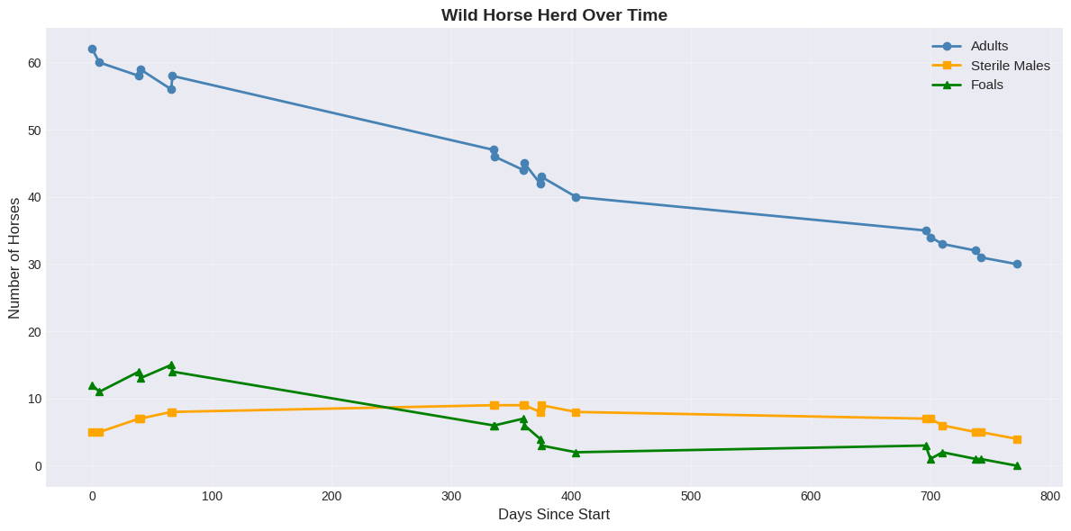
Observation from time series:
ALL variables are DECREASING over time
The herd is gradually shrinking
Foals are decreasing as the herd shrinks
Question: Are sterile males actually reducing foal births?
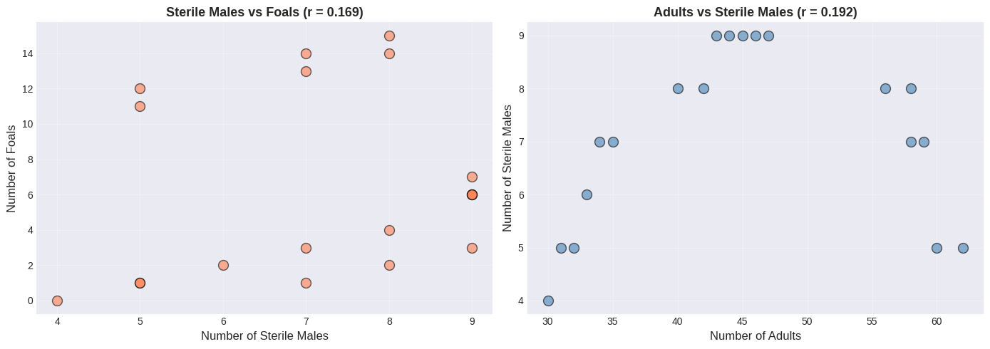
Second Analysis: Naive Correlation (WRONG!)#
# Calculate naive correlations
r_sterile_foals = np.corrcoef(sterile, foals)[0, 1]
r_sterile_adults = np.corrcoef(sterile, adults)[0, 1]
r_adults_foals = np.corrcoef(adults, foals)[0, 1]

print("Naive Correlation Analysis:")
print(f"  Sterile Males vs Foals:  r = {r_sterile_foals:+.3f}")
print(f"  Sterile Males vs Adults: r = {r_sterile_adults:+.3f}")
print(f"  Adults vs Foals:         r = {r_adults_foals:+.3f}")
Naive Correlation Analysis:
  Sterile Males vs Foals:  r = +0.169
  Sterile Males vs Adults: r = +0.192
  Adults vs Foals:         r = +0.949
🤯 Surprising Result!#
More sterile males → MORE foals? That makes no biological sense!
More sterile males → MORE adults? How is that possible?
Something is clearly wrong with this naive analysis…
# Create scatter plots (naive analysis)
fig, (ax1, ax2) = plt.subplots(1, 2, figsize=(14, 5))

ax1.scatter(sterile, foals, s=100, alpha=0.6, color='coral', edgecolors='black')
ax1.set_xlabel('Number of Sterile Males', fontsize=12)
ax1.set_ylabel('Number of Foals', fontsize=12)
ax1.set_title(f'Sterile Males vs Foals (r = {r_sterile_foals:.3f})', fontsize=13, fontweight='bold')
ax1.grid(True, alpha=0.3)

ax2.scatter(adults, sterile, s=100, alpha=0.6, color='steelblue', edgecolors='black')
ax2.set_xlabel('Number of Adults', fontsize=12)
ax2.set_ylabel('Number of Sterile Males', fontsize=12)
ax2.set_title(f'Adults vs Sterile Males (r = {r_sterile_adults:.3f})', fontsize=13, fontweight='bold')
ax2.grid(True, alpha=0.3)

plt.tight_layout()
plt.show()
The Key Insight: Time as a Lurking Variable#
Let’s plot the scatter again, but label points with the day number:
# Standardize for visualization
sterile_std = (sterile - np.mean(sterile)) / np.std(sterile)
foals_std = (foals - np.mean(foals)) / np.std(foals)
adults_std = (adults - np.mean(adults)) / np.std(adults)

# Create revealing scatter plots with day labels
fig, (ax1, ax2) = plt.subplots(1, 2, figsize=(14, 6))

# Plot invisible scatter first so axes auto-scale to the data range
ax1.scatter(sterile_std, foals_std, alpha=0)
for i in range(len(days)):
    color = 'yellow' if days[i] < 100 else 'lightblue'
    ax1.text(sterile_std[i], foals_std[i], str(days[i]),
            ha='center', va='center', fontsize=9,
            bbox=dict(boxstyle='circle', facecolor=color, alpha=0.7))
ax1.set_xlabel('Sterile Males (standardized)', fontsize=12)
ax1.set_ylabel('Foals (standardized)', fontsize=12)
ax1.set_title('Sterile Males vs Foals (labeled by DAY)', fontsize=13, fontweight='bold')
ax1.grid(True, alpha=0.3)
ax1.axhline(y=0, color='black', linewidth=0.8, alpha=0.3)
ax1.axvline(x=0, color='black', linewidth=0.8, alpha=0.3)
ax1.margins(0.15)

# Plot invisible scatter first so axes auto-scale to the data range
ax2.scatter(adults_std, sterile_std, alpha=0)
for i in range(len(days)):
    color = 'yellow' if days[i] < 100 else 'lightblue'
    ax2.text(adults_std[i], sterile_std[i], str(days[i]),
            ha='center', va='center', fontsize=9,
            bbox=dict(boxstyle='circle', facecolor=color, alpha=0.7))
ax2.set_xlabel('Adults (standardized)', fontsize=12)
ax2.set_ylabel('Sterile Males (standardized)', fontsize=12)
ax2.set_title('Adults vs Sterile Males (labeled by DAY)', fontsize=13, fontweight='bold')
ax2.grid(True, alpha=0.3)
ax2.axhline(y=0, color='black', linewidth=0.8, alpha=0.3)
ax2.axvline(x=0, color='black', linewidth=0.8, alpha=0.3)
ax2.margins(0.15)

plt.tight_layout()
plt.show()
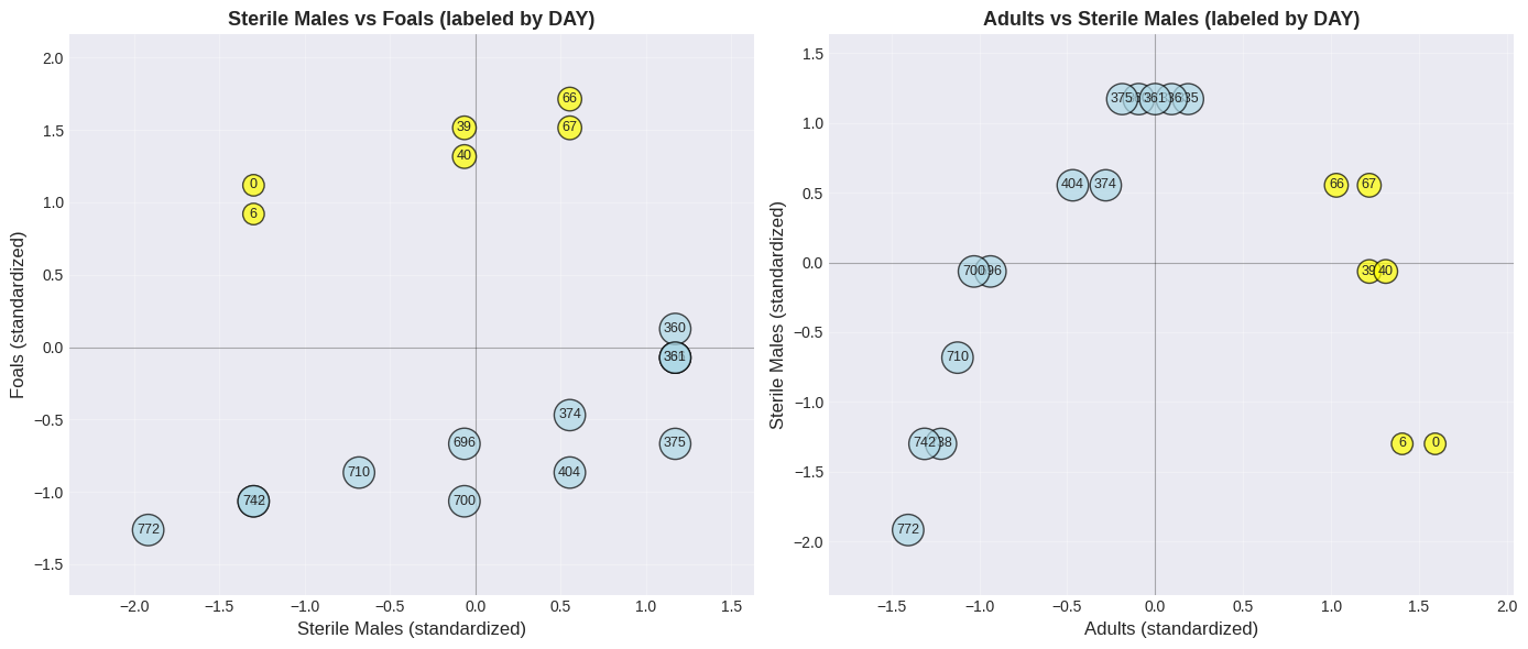
🔍 The Revelation!#
Look at the day numbers in the plot:
Yellow (early days): Upper right → many adults, many foals
Blue (later days): Lower left → few adults, few foals
The ENTIRE HERD is shrinking over time!
The positive correlation exists because:
When herd is large → more adults AND more sterile males AND more foals
When herd is small → fewer of everything
⚠️ The correlation is driven by TIME, not causation!
Correct Analysis: Correlation with Time#
# Calculate correlations with TIME
r_adults_time = np.corrcoef(days, adults)[0, 1]
r_sterile_time = np.corrcoef(days, sterile)[0, 1]
r_foals_time = np.corrcoef(days, foals)[0, 1]

print("Correlation with TIME:")
print(f"  Adults vs Time:        r = {r_adults_time:.3f}")
print(f"  Sterile Males vs Time: r = {r_sterile_time:.3f}")
print(f"  Foals vs Time:         r = {r_foals_time:.3f}")

# Rate of decline calculation
time_std = np.std(days)
adults_std_val = np.std(adults)
foals_std_val = np.std(foals)

print(f"\nRate of decline (per {time_std:.0f} days):")
print(f"  Adults: {r_adults_time * adults_std_val:.1f} horses")
print(f"  Foals: {r_foals_time * foals_std_val:.1f} foals")
Correlation with TIME:
  Adults vs Time:        r = -0.988
  Sterile Males vs Time: r = -0.272
  Foals vs Time:         r = -0.928

Rate of decline (per 275 days):
  Adults: -10.6 horses
  Foals: -4.7 foals
✅ Conclusion#
All correlations with time are negative - the herd is naturally declining.
The original positive correlation between sterile males and foals was SPURIOUS - caused by the lurking time variable!
Key Lesson: To understand a simple dataset, plot it MULTIPLE WAYS!
Plot each variable vs time
Create scatter plots
Calculate correlations
Think about confounding variables!
More Correlation Examples#
Worked Example: Study Hours vs Test Errors#
Expect negative correlation!
study_hours = np.array([8, 7, 6, 5, 4, 3, 2, 1])
errors = np.array([2, 3, 4, 5, 7, 9, 12, 15])

r_study = np.corrcoef(study_hours, errors)[0, 1]

plt.figure(figsize=(10, 6))
plt.scatter(study_hours, errors, s=150, alpha=0.7, color='purple', edgecolors='black')

for i in range(len(study_hours)):
    plt.text(study_hours[i], errors[i], f'S{i+1}', ha='center', va='center',
            fontweight='bold', color='white')

plt.xlabel('Study Hours', fontsize=12)
plt.ylabel('Number of Errors on Test', fontsize=12)
plt.title(f'Study Hours vs Errors (r = {r_study:.3f})', fontsize=14, fontweight='bold')
plt.grid(True, alpha=0.3)
plt.tight_layout()
plt.show()

print(f"Correlation: r = {r_study:.3f} (Strong NEGATIVE)")
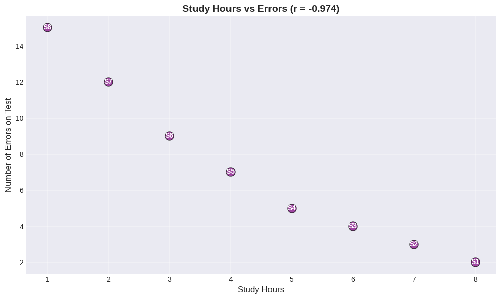
Correlation: r = -0.974 (Strong NEGATIVE)
Interpretation:
More study → fewer errors
Less study → more errors
This makes sense both intuitively AND statistically! This is an example where correlation likely reflects a causal relationship.
Correlation Pitfalls#
Pitfall 1: Non-Linear Relationships#
Correlation only measures LINEAR relationships!
Non-linear patterns can have low correlation despite strong relationships.
# Generate different relationship types
x_range = np.linspace(-5, 5, 100)

y_linear = x_range + np.random.normal(0, 0.5, 100)
y_quadratic = x_range**2 + np.random.normal(0, 2, 100)
y_exponential = np.exp(x_range/3) + np.random.normal(0, 1, 100)
y_sinusoidal = 3 * np.sin(x_range) + np.random.normal(0, 0.3, 100)

# Calculate correlations
r_linear = np.corrcoef(x_range, y_linear)[0, 1]
r_quadratic = np.corrcoef(x_range, y_quadratic)[0, 1]
r_exponential = np.corrcoef(x_range, y_exponential)[0, 1]
r_sinusoidal = np.corrcoef(x_range, y_sinusoidal)[0, 1]

# Plot
fig, axes = plt.subplots(2, 2, figsize=(12, 10))

axes[0,0].scatter(x_range, y_linear, alpha=0.5, s=20, color='green')
axes[0,0].set_title(f'Linear: y = x (r = {r_linear:.3f})', fontsize=12, fontweight='bold')
axes[0,0].grid(True, alpha=0.3)

axes[0,1].scatter(x_range, y_quadratic, alpha=0.5, s=20, color='blue')
axes[0,1].set_title(f'Quadratic: y = x² (r = {r_quadratic:.3f})', fontsize=12, fontweight='bold')
axes[0,1].grid(True, alpha=0.3)

axes[1,0].scatter(x_range, y_exponential, alpha=0.5, s=20, color='orange')
axes[1,0].set_title(f'Exponential: y = e^(x/3) (r = {r_exponential:.3f})', fontsize=12, fontweight='bold')
axes[1,0].grid(True, alpha=0.3)

axes[1,1].scatter(x_range, y_sinusoidal, alpha=0.5, s=20, color='red')
axes[1,1].set_title(f'Sinusoidal: y = 3sin(x) (r = {r_sinusoidal:.3f})', fontsize=12, fontweight='bold')
axes[1,1].grid(True, alpha=0.3)

for ax in axes.flat:
    ax.set_xlabel('X')
    ax.set_ylabel('Y')

plt.suptitle('Correlation Only Measures LINEAR Relationships!', fontsize=14, fontweight='bold')
plt.tight_layout()
plt.show()
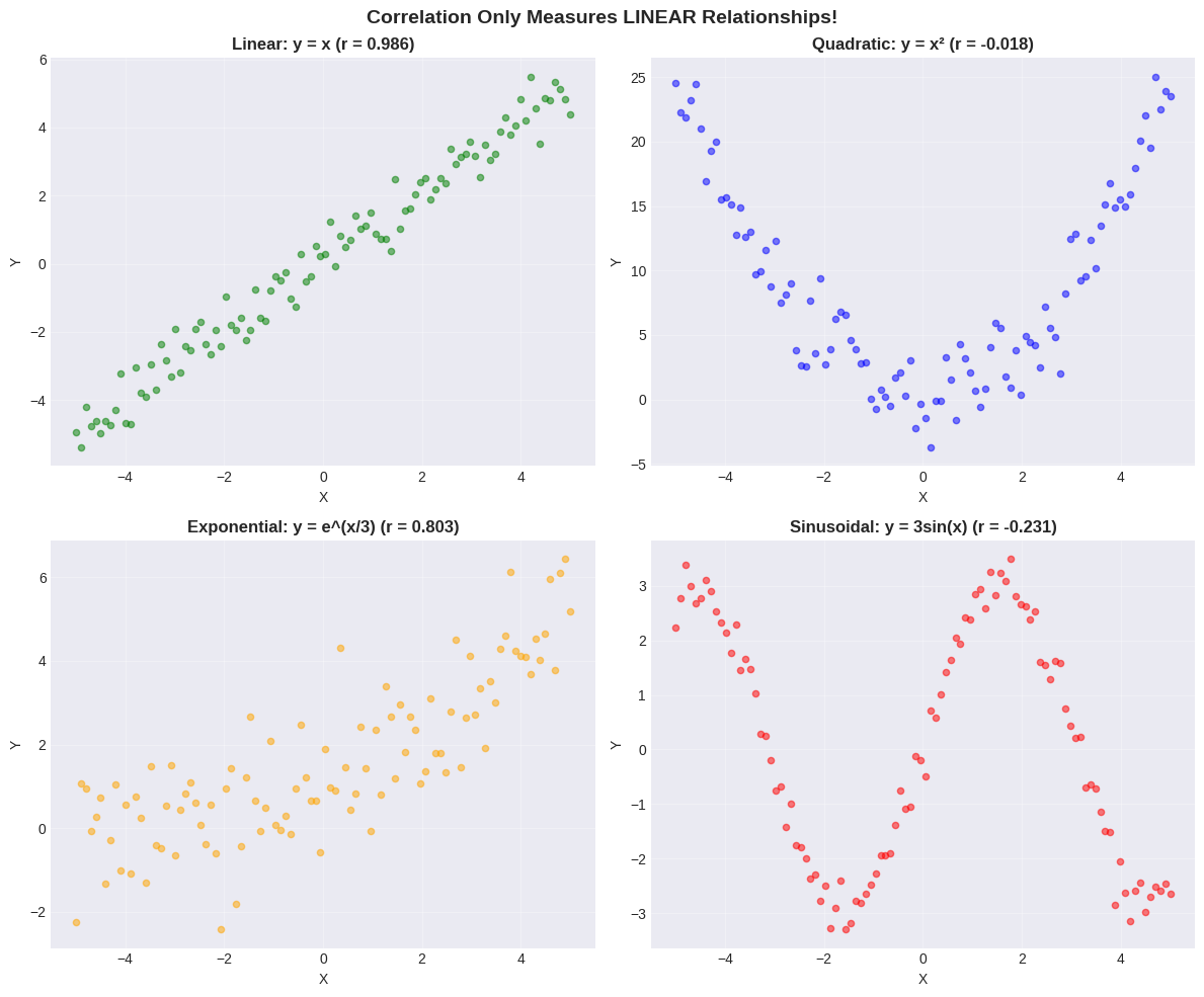
⚠️ Critical Lesson#
ALWAYS plot your data first! Correlation can miss:
Quadratic relationships (U-shaped) - perfect relationship but low \(r\)!
Exponential relationships - \(r\) can be misleading
Periodic relationships - \(r \approx 0\) despite clear pattern
Other non-linear patterns
Don’t rely on correlation alone - USE SCATTER PLOTS!
Pitfall 2: Outliers#
A single outlier can drastically change correlation!
# Create clean data
x_clean = np.array([1, 2, 3, 4, 5])
y_clean = np.array([2, 4, 6, 8, 10])
r_clean = np.corrcoef(x_clean, y_clean)[0, 1]

# Add outlier
x_outlier = np.append(x_clean, 6)
y_outlier = np.append(y_clean, 1)
r_outlier = np.corrcoef(x_outlier, y_outlier)[0, 1]

# Visualize
fig, (ax1, ax2) = plt.subplots(1, 2, figsize=(14, 5))

ax1.scatter(x_clean, y_clean, s=150, color='green', alpha=0.7, edgecolors='black', linewidths=2)
ax1.set_title(f'Without Outlier (r = {r_clean:.3f})', fontsize=13, fontweight='bold')
ax1.set_xlabel('X')
ax1.set_ylabel('Y')
ax1.grid(True, alpha=0.3)
ax1.set_xlim(0, 7)
ax1.set_ylim(0, 11)

ax2.scatter(x_clean, y_clean, s=150, color='blue', alpha=0.7, edgecolors='black', linewidths=2, label='Clean data')
ax2.scatter(x_outlier[-1], y_outlier[-1], s=300, color='red', marker='*',
           edgecolors='darkred', linewidths=2, label='OUTLIER', zorder=5)
ax2.set_title(f'With Outlier (r = {r_outlier:.3f})', fontsize=13, fontweight='bold')
ax2.set_xlabel('X')
ax2.set_ylabel('Y')
ax2.grid(True, alpha=0.3)
ax2.set_xlim(0, 7)
ax2.set_ylim(0, 11)
ax2.legend()

plt.tight_layout()
plt.show()

print(f"Original: r = {r_clean:.3f} (perfect)")
print(f"With outlier: r = {r_outlier:.3f}")
print(f"Change: {abs(r_clean - r_outlier):.3f} from just ONE point!")
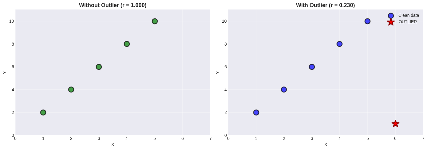
Original: r = 1.000 (perfect)
With outlier: r = 0.230
Change: 0.770 from just ONE point!
🚨 Outlier Impact#
A single outlier can drastically change correlation!
Best practices:
Always look at scatter plots
Compute correlation with/without outliers
Investigate why outliers exist
Consider robust methods (Spearman correlation)
Pitfall 3: The Scaling Problem#
Axis scaling can make relationships look stronger or weaker than they are!
# Same data, different scales
x_demo = np.random.normal(50, 10, 50)
y_demo = 0.8 * x_demo + np.random.normal(0, 5, 50)
r_demo = np.corrcoef(x_demo, y_demo)[0, 1]

fig, (ax1, ax2, ax3) = plt.subplots(1, 3, figsize=(15, 4))

# Compressed y-axis
ax1.scatter(x_demo, y_demo, alpha=0.6, s=50, color='steelblue')
ax1.set_ylim(0, 200)
ax1.set_title('Compressed Y-axis (looks weaker)', fontsize=12, fontweight='bold')
ax1.set_xlabel('X')
ax1.set_ylabel('Y')
ax1.grid(True, alpha=0.3)

# Proper scale
ax2.scatter(x_demo, y_demo, alpha=0.6, s=50, color='green')
ax2.set_title(f'Proper Scale (r = {r_demo:.3f})', fontsize=12, fontweight='bold')
ax2.set_xlabel('X')
ax2.set_ylabel('Y')
ax2.grid(True, alpha=0.3)

# Standardized
x_std_demo = (x_demo - np.mean(x_demo)) / np.std(x_demo)
y_std_demo = (y_demo - np.mean(y_demo)) / np.std(y_demo)
ax3.scatter(x_std_demo, y_std_demo, alpha=0.6, s=50, color='purple')
ax3.set_title('Standardized (always clear)', fontsize=12, fontweight='bold')
ax3.set_xlabel('X (std)')
ax3.set_ylabel('Y (std)')
ax3.grid(True, alpha=0.3)
ax3.axhline(y=0, color='black', linewidth=0.8, alpha=0.3)
ax3.axvline(x=0, color='black', linewidth=0.8, alpha=0.3)

plt.suptitle(f'Same Data (r = {r_demo:.3f}), Different Scales!', fontsize=14, fontweight='bold')
plt.tight_layout()
plt.show()
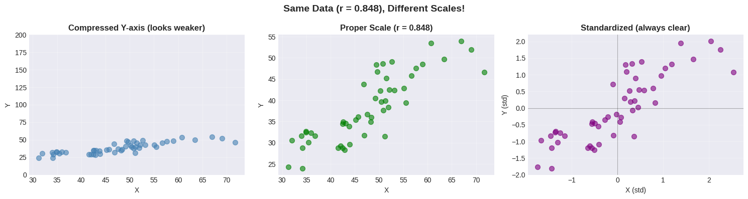
🚨 Scaling Matters!#
The same data can look different with different axis scales.
Solution: Use standardized coordinates!
Removes unit effects
Centers at (0,0)
Makes patterns crystal clear
Correlation Matrix#
For datasets with multiple variables, compute all pairwise correlations at once!
# Generate multi-variable dataset
np.random.seed(42)
n = 100

age = np.random.uniform(20, 60, n)
height = np.random.normal(170, 10, n)
weight = 0.6 * height + 0.1 * age + np.random.normal(0, 5, n)
shoe_size = 0.15 * height + np.random.normal(-10, 2, n)
income = 1000 * age + 500 * height + np.random.normal(0, 10000, n)

data_multi = pd.DataFrame({
    'Age': age, 'Height': height, 'Weight': weight,
    'Shoe_Size': shoe_size, 'Income': income
})

# Correlation matrix
corr_matrix = data_multi.corr()
print("Correlation Matrix:")
print(corr_matrix.round(3))

# Find strongest correlations
mask = np.triu(np.ones_like(corr_matrix), k=1).astype(bool)
corr_values = corr_matrix.where(mask).stack()
corr_sorted = corr_values.abs().sort_values(ascending=False)

print("\nTop 5 Correlations:")
for i, (pair, val) in enumerate(corr_sorted.head(5).items(), 1):
    original_val = corr_matrix.loc[pair[0], pair[1]]
    print(f"  {i}. {pair[0]:10s} - {pair[1]:10s}: r = {original_val:+.3f}")
Correlation Matrix:
             Age  Height  Weight  Shoe_Size  Income
Age        1.000  -0.150   0.050     -0.062   0.661
Height    -0.150   1.000   0.678      0.673   0.259
Weight     0.050   0.678   1.000      0.411   0.258
Shoe_Size -0.062   0.673   0.411      1.000   0.255
Income     0.661   0.259   0.258      0.255   1.000

Top 5 Correlations:
  1. Height     - Weight    : r = +0.678
  2. Height     - Shoe_Size : r = +0.673
  3. Age        - Income    : r = +0.661
  4. Weight     - Shoe_Size : r = +0.411
  5. Height     - Income    : r = +0.259
# Visualize as heatmap
plt.figure(figsize=(9, 7))
sns.heatmap(corr_matrix, annot=True, fmt='.3f', cmap='coolwarm',
            center=0, square=True, linewidths=2,
            cbar_kws={"shrink": 0.8, "label": "Correlation"})
plt.title('Correlation Matrix Heat Map', fontsize=14, fontweight='bold')
plt.tight_layout()
plt.show()
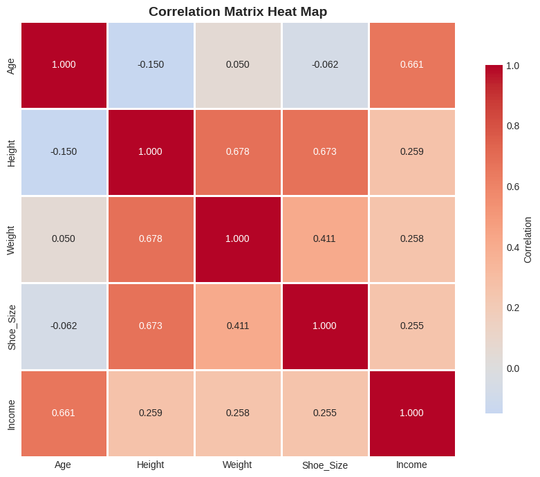
Reading Heat Maps#
Color |
Meaning |
|---|---|
🔴 Red |
Strong positive correlation |
🔵 Blue |
Strong negative correlation |
⚪ White |
No correlation |
Heat maps make it easy to spot patterns in multi-variable datasets at a glance!
Alternative Correlation Measures#
Spearman’s Rank Correlation#
Uses ranks instead of values:
Robust to outliers
Works for monotonic (not necessarily linear) relationships
Range still -1 to +1
from scipy.stats import spearmanr

# Data with extreme outlier
x_extreme = np.array([1, 2, 3, 4, 5, 1000])  # Huge outlier!
y_extreme = np.array([2, 4, 6, 8, 10, 12])

r_pearson = stats.pearsonr(x_extreme, y_extreme)[0]
r_spearman = spearmanr(x_extreme, y_extreme)[0]

# Visualize
fig, (ax1, ax2) = plt.subplots(1, 2, figsize=(14, 5))

ax1.scatter(x_extreme[:-1], y_extreme[:-1], s=150, color='green',
           alpha=0.7, edgecolors='black', linewidths=2, label='Normal data')
ax1.scatter(x_extreme[-1], y_extreme[-1], s=400, color='red', marker='*',
           edgecolors='darkred', linewidths=3, label='OUTLIER', zorder=5)
ax1.set_xlabel('X')
ax1.set_ylabel('Y')
ax1.set_title('Data with Extreme Outlier', fontsize=13, fontweight='bold')
ax1.legend()
ax1.grid(True, alpha=0.3)

methods = ['Pearson\n(sensitive)', 'Spearman\n(robust)']
values = [r_pearson, r_spearman]
colors = ['coral' if v < 0.9 else 'green' for v in values]

bars = ax2.bar(methods, values, color=colors, alpha=0.7, edgecolor='black', linewidth=2)
ax2.set_ylabel('Correlation Coefficient')
ax2.set_title('Pearson vs Spearman', fontsize=13, fontweight='bold')
ax2.set_ylim(0, 1.1)
ax2.grid(axis='y', alpha=0.3)

for bar, val in zip(bars, values):
    ax2.text(bar.get_x() + bar.get_width()/2, bar.get_height() + 0.03,
            f'{val:.3f}', ha='center', fontsize=13, fontweight='bold')

plt.tight_layout()
plt.show()

print(f"Pearson:  r = {r_pearson:.3f} (affected by outlier)")
print(f"Spearman: ρ = {r_spearman:.3f} (robust!)")
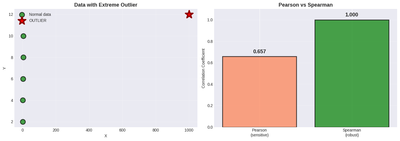
Pearson:  r = 0.657 (affected by outlier)
Spearman: ρ = 1.000 (robust!)
Why Spearman is Robust#
Spearman uses RANKS instead of actual values:
x values:    [1,    2,    3,    4,    5,    1000]
x ranks:     [1,    2,    3,    4,    5,    6   ]
                                          ↑
                      Outlier becomes just "rank 6", not 1000!
Extreme values become just “highest rank” → outliers have less impact!
🎯 Summary: When to Use What#
Decision Tree#
Does your data have outliers?
│
├── NO → Use Pearson correlation
│
└── YES → Is the relationship linear?
    │
    ├── YES, but with outliers → Use Spearman
    │
    └── NO, non-linear → Use Spearman or transform data
Quick Reference Table#
Method |
Best For |
Robust to Outliers? |
Measures |
|---|---|---|---|
Pearson |
Linear relationships |
❌ No |
Linear correlation |
Spearman |
Monotonic relationships |
✔️ Yes |
Rank correlation |
Kendall |
Small samples, many ties |
✔️ Yes |
Concordance |
📝 Practice Problems#
Work through these to master correlation!
Problem 1: Weight and Adiposity#
Given: \(r = 0.9\), mean weight = 150 lb, \(\sigma_{weight} = 30\) lb
Adiposity: mean = 0.8, \(\sigma_{adiposity} = 0.1\)
Tasks:
Predict adiposity for weight = 170 lb
Predict weight for adiposity = 0.75
What is the RMSE of predictions?
Problem 2: Income and IQ#
Given: \(r = 0.30\), mean income = $60,000, \(\sigma_{income} = \$20,000\)
IQ: mean = 100, \(\sigma_{IQ} = 15\)
Tasks:
Predict IQ for income = $70,000
How reliable is this prediction?
If family income increases, does the child’s IQ increase?
Problem 3: Identify the Issue#
For each scenario, identify why correlation might be misleading:
Hospital size (beds) vs mortality rate: r = +0.65
Hint: Larger hospitals handle sicker patients
Chocolate consumption per capita vs Nobel prizes per capita (by country): r = +0.79
Hint: Think about wealth
Number of firefighters vs fire damage: r = +0.80
Hint: What determines both?
Solutions to Practice Problems#
# PROBLEM 1: Weight and Adiposity
r = 0.9
weight_mean, weight_std = 150, 30
adip_mean, adip_std = 0.8, 0.1

# Task 1: Predict adiposity for 170 lb
weight_new = 170
adip_pred = adip_mean + r * (adip_std / weight_std) * (weight_new - weight_mean)

# Task 2: Predict weight for adiposity 0.75
adip_new = 0.75
weight_pred = weight_mean + r * (weight_std / adip_std) * (adip_new - adip_mean)

# Task 3: RMSE
rmse = weight_std * np.sqrt(1 - r**2)

print("PROBLEM 1 SOLUTIONS")
print(f"1. For weight = 170 lb: Predicted adiposity = {adip_pred:.3f}")
print(f"2. For adiposity = 0.75: Predicted weight = {weight_pred:.1f} lb")
print(f"3. RMSE = {rmse:.1f} lb, r² = {r**2:.2f} ({r**2*100:.0f}% variance explained)")

# PROBLEM 2: Income and IQ
r2 = 0.30
income_mean, income_std = 60000, 20000
iq_mean, iq_std = 100, 15

income_new = 70000
iq_pred = iq_mean + r2 * (iq_std / income_std) * (income_new - income_mean)
rmse2 = iq_std * np.sqrt(1 - r2**2)

print("\nPROBLEM 2 SOLUTIONS")
print(f"1. For income = $70,000: Predicted IQ = {iq_pred:.1f}")
print(f"2. RMSE = {rmse2:.1f} IQ points, r² = {r2**2:.2f} ({r2**2*100:.0f}% variance explained)")
print("3. Correlation ≠ causation! Giving money won't increase IQ.")
PROBLEM 1 SOLUTIONS
1. For weight = 170 lb: Predicted adiposity = 0.860
2. For adiposity = 0.75: Predicted weight = 136.5 lb
3. RMSE = 13.1 lb, r² = 0.81 (81% variance explained)

PROBLEM 2 SOLUTIONS
1. For income = $70,000: Predicted IQ = 102.2
2. RMSE = 14.3 IQ points, r² = 0.09 (9% variance explained)
3. Correlation ≠ causation! Giving money won't increase IQ.
Problem 3 Solutions: Identify the Confound#
Scenario |
Correlation |
Confounding Variable |
|---|---|---|
Hospital size vs mortality |
r = +0.65 |
Patient severity - larger hospitals treat sicker patients |
Chocolate vs Nobel prizes |
r = +0.79 |
National wealth - affects both chocolate consumption and research funding |
Firefighters vs damage |
r = +0.80 |
Fire severity - bigger fires need more firefighters AND cause more damage |
Key Insight: In each case, correlation exists but causation goes through a third variable!
🎯 Key Takeaways#
The Essential Rules#
Correlation measures LINEAR relationships
Range: -1 to +1 (always!)
Sign indicates direction
Magnitude indicates strength
Correlation enables prediction
Formula: \(\hat{y} = \bar{y} + r \cdot \frac{\sigma_y}{\sigma_x}(x - \bar{x})\)
Rule of thumb: 1 std dev in x → r std devs in y
Accuracy: RMSE = \(\sigma_y\sqrt{1-r^2}\)
CORRELATION ≠ CAUSATION (never forget!)
Three possible explanations:
X causes Y
Y causes X
Hidden variable Z causes both
Always visualize first!
Scatter plots reveal patterns
Correlation is just a number
Non-linear patterns need different methods
Watch for confounding variables
Time is often a lurking variable
Both variables might be caused by a third
Control for confounds in analysis
Common Mistakes to Avoid#
❌ Assuming high correlation means causation ❌ Using correlation for non-linear relationships ❌ Ignoring outliers ❌ Not plotting data first ❌ Forgetting about confounding variables ❌ Using inappropriate axis scales
✅ Always plot first (scatter plots!) ✅ Check for outliers ✅ Standardize when comparing ✅ Consider Spearman for robustness ✅ Think critically about WHY variables correlate ✅ Report both r and p-value