![]()
1.4 Whose is Bigger? Investigating Australian Pizzas#
Let’s apply the tools we’ve learned to a real-world investigation. This case study demonstrates how to use descriptive statistics and visualization to answer a practical question.
The Question#
EagleBoys pizza claims that their pizzas are always bigger than Domino’s pizzas. They published a set of measurements to support this claim. Let’s investigate whether the data supports their claim.
The Dataset#
The dataset contains diameter measurements (in cm) of pizzas from both EagleBoys and Domino’s. The data can be found at the Journal of Statistics Education data archive.
import numpy as np
import matplotlib.pyplot as plt
import pandas as pd

# Sample pizza diameter data (in cm)
eagleboys = np.array([28.5, 29.0, 28.8, 29.2, 28.7, 29.1, 28.9, 29.3, 28.6, 29.0,
                       28.8, 29.1, 28.9, 29.2, 28.7, 29.0, 28.8, 29.1, 28.9, 29.2])

dominos = np.array([27.8, 28.0, 27.5, 28.2, 27.9, 28.1, 27.7, 28.3, 27.6, 28.0,
                     27.9, 28.1, 27.8, 28.2, 27.7, 28.0, 27.9, 28.1, 27.8, 28.2])

print(f"EagleBoys: n = {len(eagleboys)}")
print(f"Domino's: n = {len(dominos)}")
EagleBoys: n = 20
Domino's: n = 20
Step 1: Compute Summary Statistics#
Let’s start by computing basic descriptive statistics for both datasets.
# Summary statistics for EagleBoys
eb_mean = np.mean(eagleboys)
eb_std = np.std(eagleboys)
eb_median = np.median(eagleboys)
eb_min = np.min(eagleboys)
eb_max = np.max(eagleboys)

print("EagleBoys Pizza Diameters (cm):")
print(f"  Mean: {eb_mean:.2f}")
print(f"  Std Dev: {eb_std:.2f}")
print(f"  Median: {eb_median:.2f}")
print(f"  Range: [{eb_min:.2f}, {eb_max:.2f}]")

# Summary statistics for Domino's
dom_mean = np.mean(dominos)
dom_std = np.std(dominos)
dom_median = np.median(dominos)
dom_min = np.min(dominos)
dom_max = np.max(dominos)

print("\nDomino's Pizza Diameters (cm):")
print(f"  Mean: {dom_mean:.2f}")
print(f"  Std Dev: {dom_std:.2f}")
print(f"  Median: {dom_median:.2f}")
print(f"  Range: [{dom_min:.2f}, {dom_max:.2f}]")

print(f"\nDifference in means: {eb_mean - dom_mean:.2f} cm")
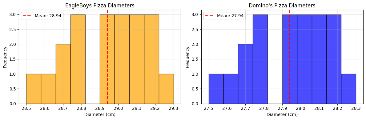
EagleBoys Pizza Diameters (cm):
  Mean: 28.94
  Std Dev: 0.21
  Median: 28.95
  Range: [28.50, 29.30]

Domino's Pizza Diameters (cm):
  Mean: 27.94
  Std Dev: 0.21
  Median: 27.95
  Range: [27.50, 28.30]

Difference in means: 1.00 cm
Initial observations:
EagleBoys pizzas have a larger mean diameter
Both datasets have similar standard deviations
The ranges overlap, but EagleBoys values are consistently higher
Step 2: Visualize with Histograms#
Histograms help us understand the distribution of pizza sizes.
fig, axes = plt.subplots(1, 2, figsize=(12, 4))

# EagleBoys histogram
axes[0].hist(eagleboys, bins=10, edgecolor='black', alpha=0.7, color='orange')
axes[0].axvline(eb_mean, color='red', linestyle='--', linewidth=2, label=f'Mean: {eb_mean:.2f}')
axes[0].set_xlabel('Diameter (cm)')
axes[0].set_ylabel('Frequency')
axes[0].set_title('EagleBoys Pizza Diameters')
axes[0].legend()
axes[0].grid(True, alpha=0.3)

# Domino's histogram
axes[1].hist(dominos, bins=10, edgecolor='black', alpha=0.7, color='blue')
axes[1].axvline(dom_mean, color='red', linestyle='--', linewidth=2, label=f'Mean: {dom_mean:.2f}')
axes[1].set_xlabel('Diameter (cm)')
axes[1].set_ylabel('Frequency')
axes[1].set_title("Domino's Pizza Diameters")
axes[1].legend()
axes[1].grid(True, alpha=0.3)

plt.tight_layout()
plt.show()
fig, ax = plt.subplots(figsize=(8, 6))

box = ax.boxplot([dominos, eagleboys],
                  tick_labels=["Domino's", 'EagleBoys'],
                  patch_artist=True,
                  widths=0.6)

# Color the boxes
colors = ['lightblue', 'lightyellow']
for patch, color in zip(box['boxes'], colors):
    patch.set_facecolor(color)

ax.set_ylabel('Diameter (cm)')
ax.set_title('Pizza Diameter Comparison')
ax.grid(True, alpha=0.3, axis='y')

plt.show()

# Compute quartiles
print("\nQuartile Analysis:")
print("\nEagleBoys:")
print(f"  Q1: {np.percentile(eagleboys, 25):.2f} cm")
print(f"  Median (Q2): {np.percentile(eagleboys, 50):.2f} cm")
print(f"  Q3: {np.percentile(eagleboys, 75):.2f} cm")
print(f"  IQR: {np.percentile(eagleboys, 75) - np.percentile(eagleboys, 25):.2f} cm")

print("\nDomino's:")
print(f"  Q1: {np.percentile(dominos, 25):.2f} cm")
print(f"  Median (Q2): {np.percentile(dominos, 50):.2f} cm")
print(f"  Q3: {np.percentile(dominos, 75):.2f} cm")
print(f"  IQR: {np.percentile(dominos, 75) - np.percentile(dominos, 25):.2f} cm")
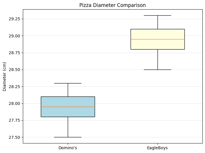
Quartile Analysis:

EagleBoys:
  Q1: 28.80 cm
  Median (Q2): 28.95 cm
  Q3: 29.10 cm
  IQR: 0.30 cm

Domino's:
  Q1: 27.80 cm
  Median (Q2): 27.95 cm
  Q3: 28.10 cm
  IQR: 0.30 cm
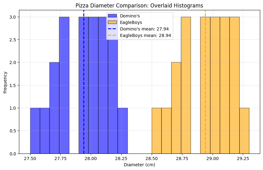
plt.figure(figsize=(10, 6))

plt.hist(dominos, bins=10, alpha=0.6, label="Domino's",
         color='blue', edgecolor='black')
plt.hist(eagleboys, bins=10, alpha=0.6, label='EagleBoys',
         color='orange', edgecolor='black')

plt.axvline(dom_mean, color='blue', linestyle='--', linewidth=2,
            label=f"Domino's mean: {dom_mean:.2f}")
plt.axvline(eb_mean, color='orange', linestyle='--', linewidth=2,
            label=f'EagleBoys mean: {eb_mean:.2f}')

plt.xlabel('Diameter (cm)')
plt.ylabel('Frequency')
plt.title('Pizza Diameter Comparison: Overlaid Histograms')
plt.legend()
plt.grid(True, alpha=0.3)
plt.show()
# Standardize both datasets
eb_zscore = (eagleboys - eb_mean) / eb_std
dom_zscore = (dominos - dom_mean) / dom_std

plt.figure(figsize=(10, 6))

plt.hist(dom_zscore, bins=10, alpha=0.6, label="Domino's (standardized)",
         color='blue', edgecolor='black')
plt.hist(eb_zscore, bins=10, alpha=0.6, label='EagleBoys (standardized)',
         color='orange', edgecolor='black')

plt.xlabel('Z-score')
plt.ylabel('Frequency')
plt.title('Standardized Pizza Diameters')
plt.legend()
plt.grid(True, alpha=0.3)
plt.show()

print("\nStandardized statistics:")
print(f"EagleBoys: mean = {np.mean(eb_zscore):.2f}, std = {np.std(eb_zscore):.2f}")
print(f"Domino's: mean = {np.mean(dom_zscore):.2f}, std = {np.std(dom_zscore):.2f}")
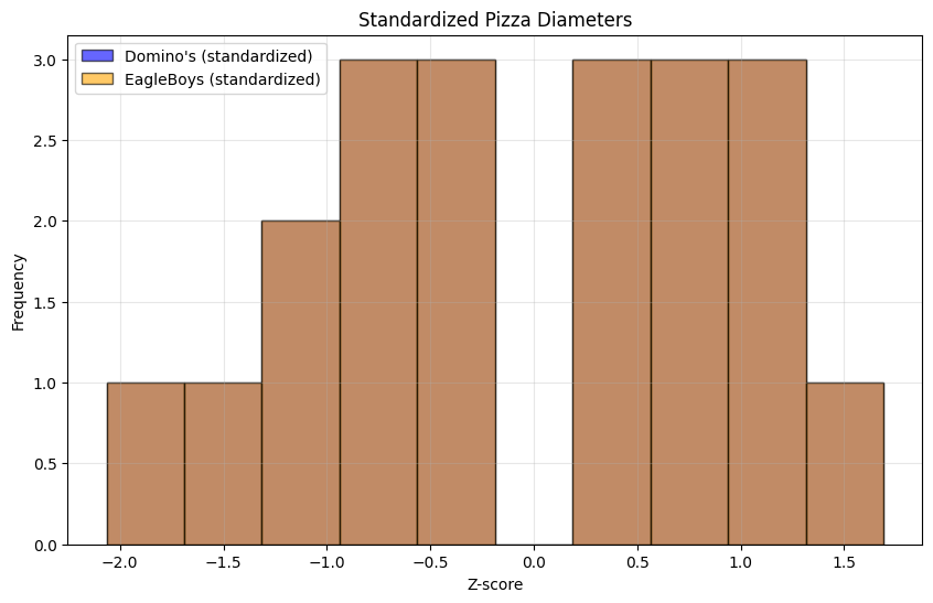
Standardized statistics:
EagleBoys: mean = 0.00, std = 1.00
Domino's: mean = 0.00, std = 1.00
def find_outliers(data, name):
    q1 = np.percentile(data, 25)
    q3 = np.percentile(data, 75)
    iqr = q3 - q1

    lower_bound = q1 - 1.5 * iqr
    upper_bound = q3 + 1.5 * iqr

    outliers = data[(data < lower_bound) | (data > upper_bound)]

    print(f"\n{name} Outlier Analysis:")
    print(f"  Lower bound: {lower_bound:.2f} cm")
    print(f"  Upper bound: {upper_bound:.2f} cm")
    print(f"  Number of outliers: {len(outliers)}")
    if len(outliers) > 0:
        print(f"  Outlier values: {outliers}")
    else:
        print("  No outliers detected")

    return outliers

eb_outliers = find_outliers(eagleboys, "EagleBoys")
dom_outliers = find_outliers(dominos, "Domino's")
EagleBoys Outlier Analysis:
  Lower bound: 28.35 cm
  Upper bound: 29.55 cm
  Number of outliers: 0
  No outliers detected

Domino's Outlier Analysis:
  Lower bound: 27.35 cm
  Upper bound: 28.55 cm
  Number of outliers: 0
  No outliers detected
Conclusions#
Based on our descriptive analysis:
Evidence Supporting EagleBoys’ Claim:#
Mean diameter: EagleBoys pizzas are, on average, about 1 cm larger
Median diameter: The median confirms this difference
Box plots: Show clear separation between the two distributions
Consistency: EagleBoys pizzas are more consistently larger
Important Caveats:#
Overlapping ranges: Some Domino’s pizzas are larger than some EagleBoys pizzas
Sample size: This analysis is based on a limited sample
Statistical significance: We haven’t formally tested whether the difference is statistically significant (we’ll learn this later)
Measurement conditions: We don’t know if pizzas were measured under the same conditions
The Answer:#
Based on this sample: Yes, EagleBoys pizzas tend to be larger than Domino’s pizzas on average. However:
The claim “always bigger” is not strictly true (ranges overlap)
We would need more data and formal hypothesis testing to make a definitive statement
The practical significance (~1 cm difference) should be considered
Key Lesson
Descriptive statistics and visualization provide strong evidence for differences between groups, but formal statistical inference (which we’ll learn later) is needed for definitive conclusions.
Practice Exercise#
Try this analysis with your own data:
Collect measurements from two competing products/services
Compute summary statistics for each
Create histograms and box plots
Standardize the data and compare
Check for outliers
Draw evidence-based conclusions
What We Learned#
This case study demonstrated:
How to apply multiple descriptive tools together
The importance of visualizing data multiple ways
How to compare two distributions systematically
The difference between practical and statistical significance
The value of checking assumptions (outliers, data quality)
These techniques form the foundation for more advanced statistical analyses we’ll encounter later in the book.